Lockdowns have caused loss of income and even industry closure. Being resourceful, many have started businesses from home, selling home baked goodies or even taking brick and mortar businesses online. We saw this as an opportunity to develop a product that would help small medium businesses to manage their transaction better. Cue - Brankas Pay.
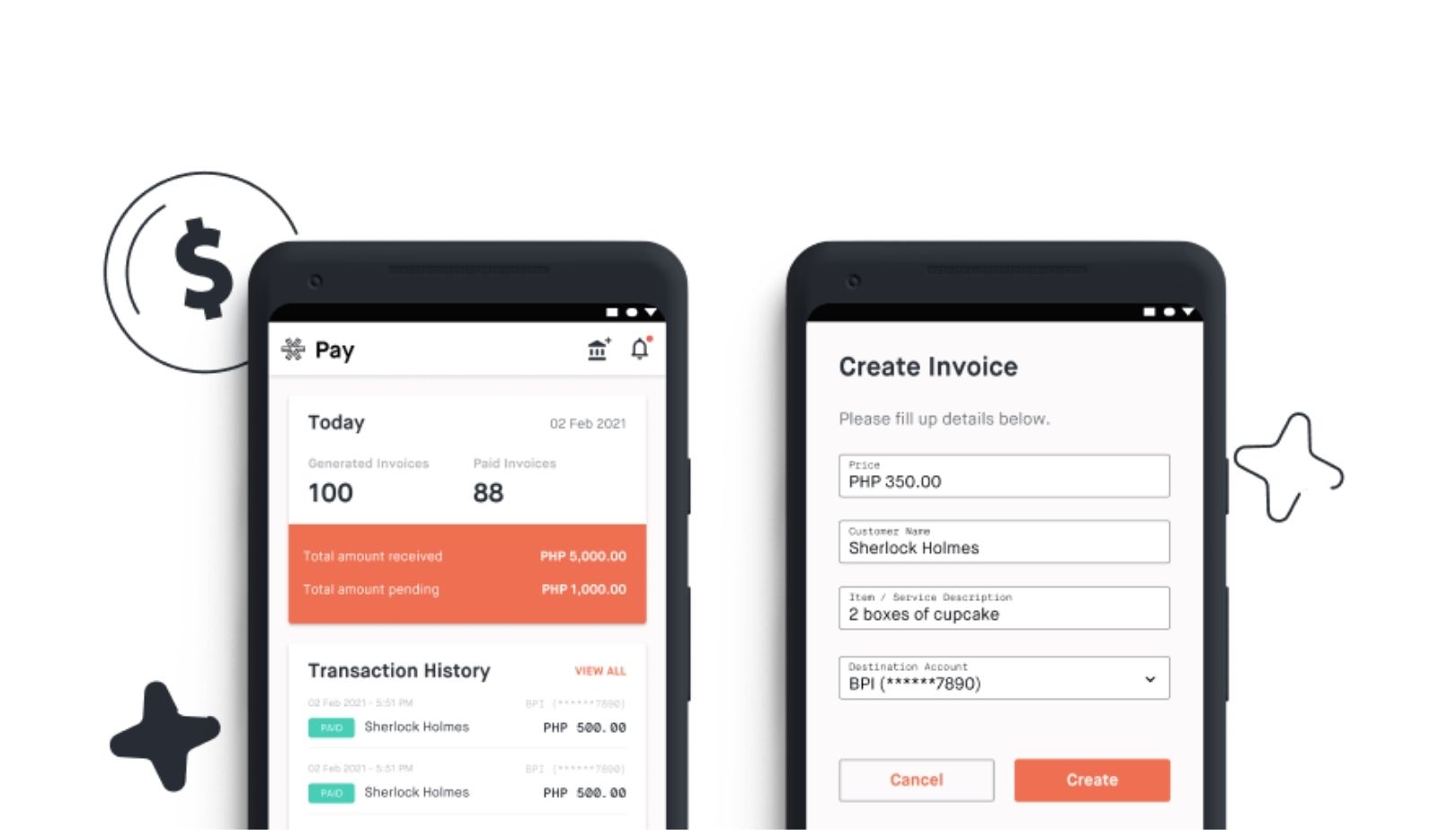
Brankas Pay is a simple bank transfer payment method that allows merchants to easily generate and reconcile invoices. It is currently available on the web and Android mobile devices. We are also actively working to integrate more payment options beyond bank transfers such as e-wallets, credit and debit cards.
As you can imagine coming up and launching a product in the region amidst a global pandemic is not without its challenges. I’d like to share 5 things we’ve learned through our experience building and launching Brankas Pay.
1. Observe the Problem

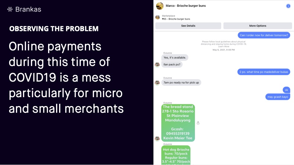
Products need problems to solve. More often than not the challenge doesn’t lie in coming up with solutions, but rather determining which problem to solve. There are a number of ways to discover what the problem is. For Brankas Pay, it was observing the struggles of the small and micro merchants that have been driven into online selling as a result of lockdowns and quarantines imposed to control the spread of COVID19.
We discovered that small and micro merchants during the pandemic are mostly new entrepreneurs and they are running their businesses online for the first time on existing platforms such as social media and messengers. This also means that they are running their businesses from start to end, contactless. This is the start of the chaos. Everything is done manually, down to sharing of account numbers, amount to be paid, to the sharing screenshots as the proof of payment. This opens to a lot of human error and the potential exposure to hackers and scammers.
Clearly singling out this problem helped our team understand what it is exactly we are building the product for, and more importantly bias towards focusing on a specific pain
point for our target customers.
2. Develop your hypothesis
Now that we have a working problem, we need to define our hypothesis – that is the overarching solution that we think would ultimately address the problem that we have identified.
Similar to problem identification, there are a multitude of ways one could develop their hypothesis. For Pay’s case, we based our hypothesis on the following guidelines:
- It builds on an existing stop gap solution that the customers are using – to lower the barrier for the user to adopt our product.
- It leverages behaviors, actions that customers are already doing to solve the problem.
- It can be built with our existing resources and technology – so we can quickly get an MVP out.
Based on the 3 guidelines and our observation of how our customers solve the problem, we know:
- They have been using their personal bank accounts to receive bank transfers as payments.
- They’ve been selling to their customers via popular messaging applications, sending bank credentials and requesting payment via Facebook Messenger, Viber and Telegram.
- Brankas has already built a bank transfer API that we could build on top of.
These 3 knowns basically was how we distilled the hypothesis that building an invoice link generation tool that will allow online merchants to accept bank transfer payments.
3. Deciding what to build, what not to build

Designing will never end, you will always find features to improve. However, with the limited resources and time we had to prioritize and move accordingly. We started with our first target which was to garner 10 sign ups. To reach that, we started designing a basic landing page to garner interest. We reached out to interest groups on different platforms and reached our first target and that led us to create the Invoice page. This invoice page allows merchants to easily generate their invoices.
That was the approach that we took to grow the product. Now, we’re at the stage of partnering with payment gateways and service providers like Visa, QRIS providers, e wallets and more. More payment options on Brankas Pay. This however does not mean that we’ve stopped improving the product features!
4. Biasing towards making it real vs making it perfect
- Clarity
We had to ensure that everyone on board was clear on the problems that the product is trying to solve and the end users. This helps us prioritise what needs to be built, design and upkeep to the product experience.
- Constraints
Knowing the constraints on hand such as resources and time helps us ensure that we move fast and efficiently. Iteration helps move
- Goals
We knew that we had to launch the product in 2 weeks and so we worked within our means with the minimum features of the product.
5. Determining future enhancements/improvements

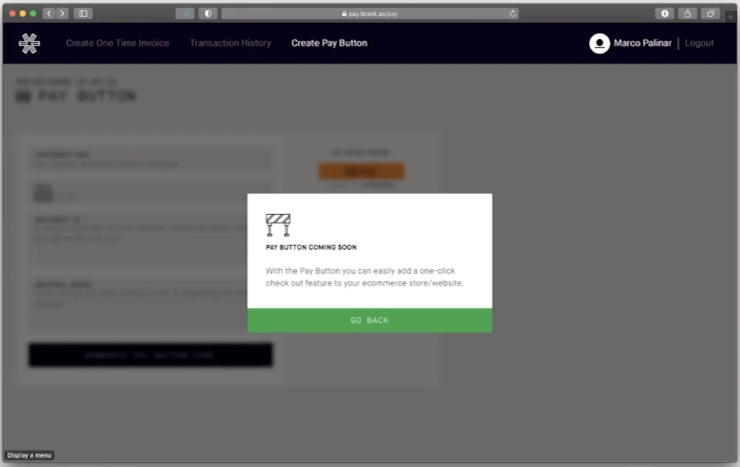
We knew that we would be building the Transaction history feature but it would not be included in the earlier design or release on the product. To tease users' curiosity, we build mockups within the product. When onboarding users onto Brankas Pay, we would ask them questions on what they expect these features could help them. This way, we could also gather interest in these future features.
Design will never stop evolving. I would highly recommend asking customers directly about their product experience, weighing resources when iterating or designing features and first versions does not have to be the last!
If you’re a merchant in The Philippines, Thailand and Indonesia and would like to improve your transaction process and experience, reach out to our team to learn more about Brankas Pay!
Download Brankas Pay on the Google Play Store today.

